Main elements
Dashboards
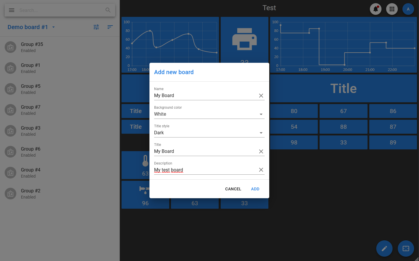
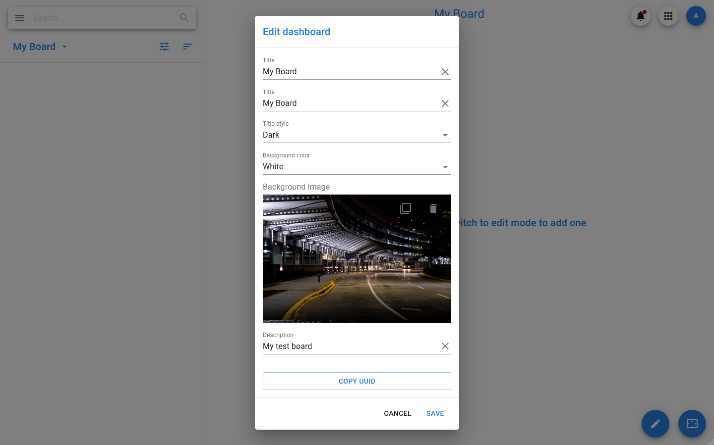
Each Pixel Board dashboard is an object that contains a reference to a group of container objects that include widgets. Each dashboard has the following properties:
- Title — the title that will be displayed when viewing the dashboard.
- Title style — the style of the dashboard title (light or dark).
- Background color — is a setting that allows you to choose the color that will fill the background if the background image is not set or is not displayed for some reason.
- Background image — the background image.
The theme selected for the app as a whole (dark or light) is applied to dashboards: it determines the background color of the dashboard, if no picture is set for it, and the color scheme of the widgets.
You can also specify groups of users who have access to the dashboard. Only users with the Admin role have access to all dashboards. All users who have access to dashboards where these widgets are included can interact with interactive widgets (use them to send commands and change settings).
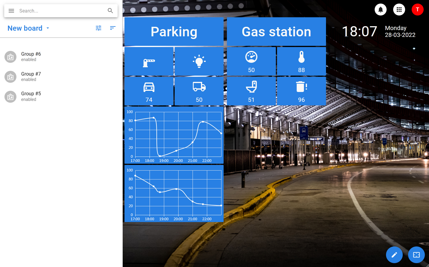
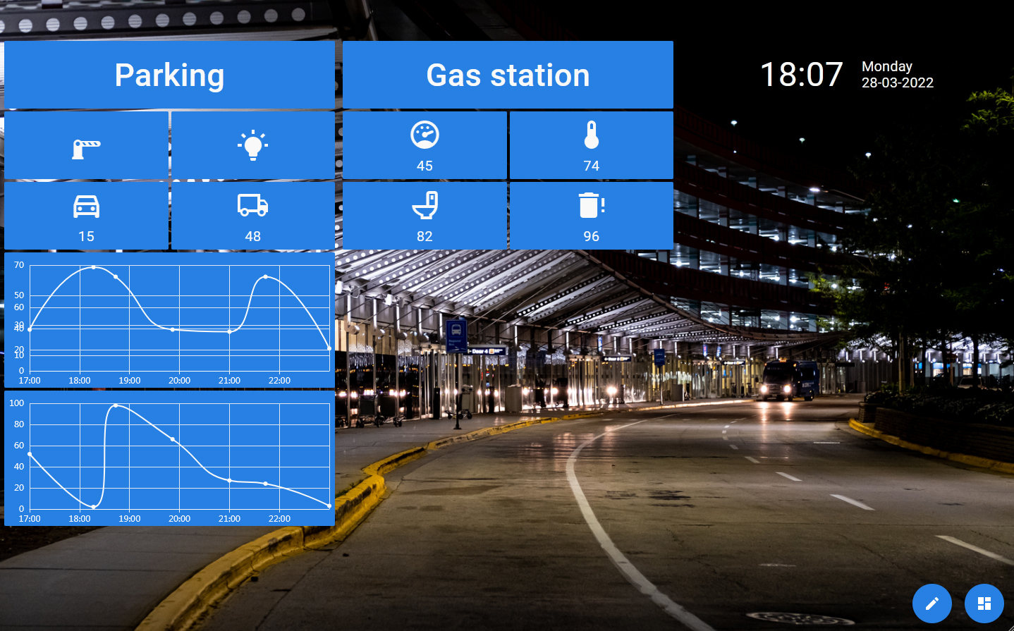
The dashboard can be displayed in one of three modes:
- Standard mode — in this mode, the dashboard is displayed if you select it in the menu. In this mode, you cannot move or change containers on the board, changing the parameters of all elements is possible only through the side information panel, which displays a list of containers or a card of the selected element (container or widget).
- Full screen mode — is a mode where the dashboard expands to full screen, and all elements, except for the edit button and the exit button from full screen mode, are hidden. The full screen button is located in the lower right corner.
- Editing mode — is a mode in which you can change the position of containers on the dashboard, as well as manage the widgets located in them (add, edit, move, delete). Switching to editing mode is possible in both standard and full screen modes.
Containers
Widgets are located in special containers that are already positioned inside the dashboard. Regardless of the type, the container contains the following information:
- The dashboard to which it belongs.
- A column inside the dashboard that occupies the container (when using the maximum grid).
- The row inside the dashboard on which it is located (when using the maximum grid).
- The width of the container (in columns).
- A list of positions inside the container, indicating the widgets that occupy them.
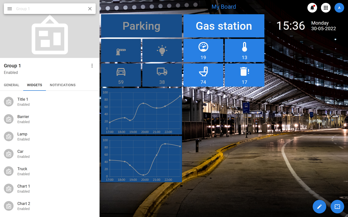
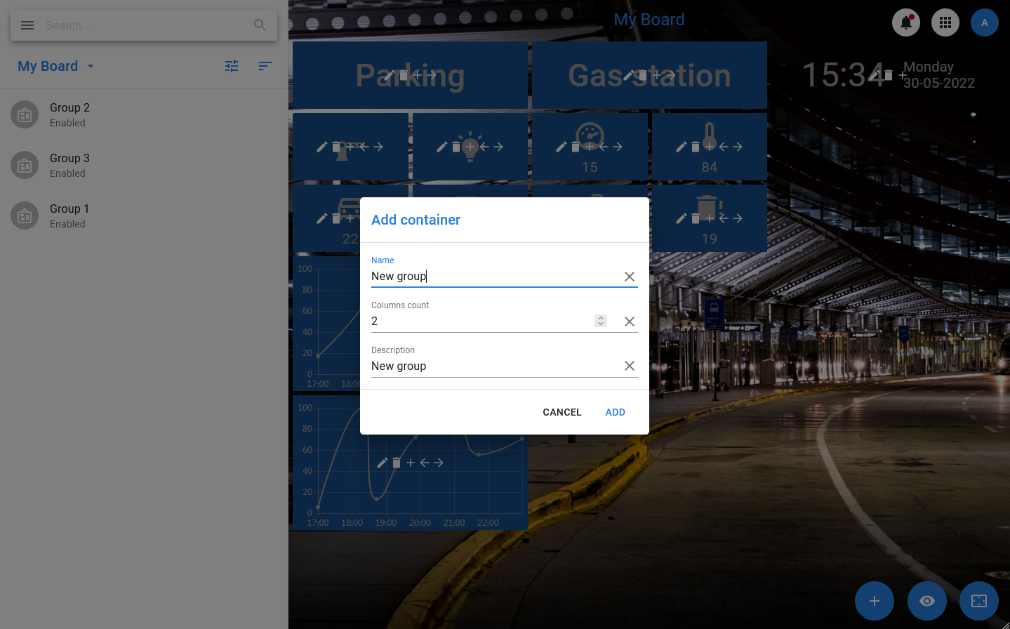
Group
A group is a simple container that represents an object that has the following properties:
- Name — the name of the container.
- Columns сount — width, represented as the number of columns that the group should occupy.
After creating a group object, widget objects are bound to it.
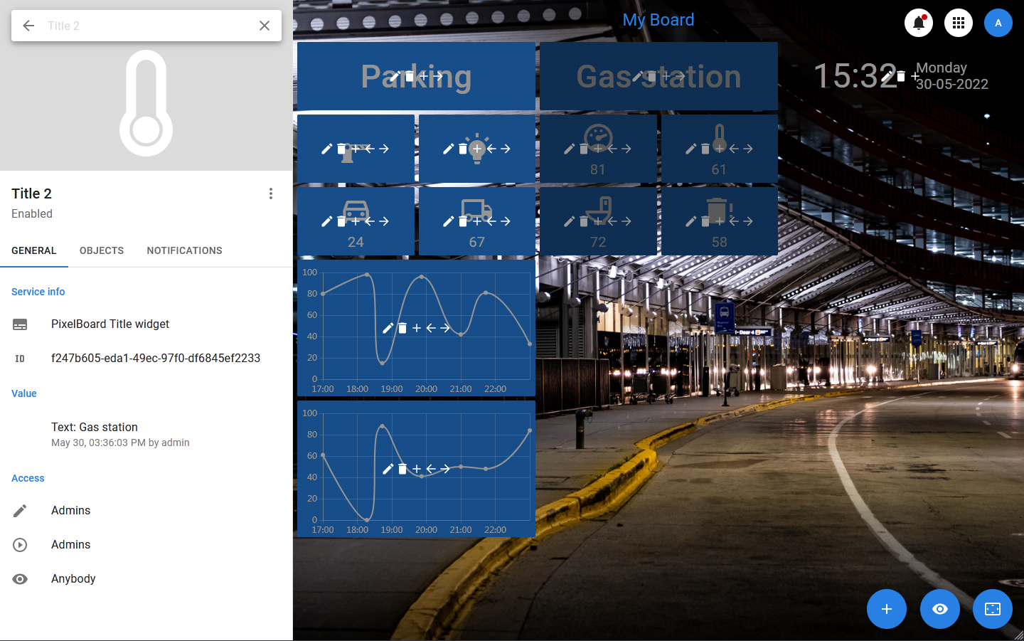
Widgets
Widgets are minimal dashboard objects designed to display or transmit information. Adding widgets to the dashboard is not done directly, but by adding them to a container that is already positioned on the board. The same widget can be added to several different containers, including those located on different boards.
Each widget stores the current value (or set of settings) that it should display, and the values of settings related to the appearance of the widget and the way the value is formed.
If the value that the widget displays has a source, the widget gets an additional property — the status, which shows the presence or absence of a connection with the source. If the source is deleted, the widget continues to exist and is displayed in all dashboards that use it, but it gets the status «lost connection with the source» and issues a corresponding notification.
At the PixelCore data storage level, widgets are datasets whose state is monitored and managed by special solvers. If a widget is bound to an object, the solver tracks changes that occur to that object: changes to the property (or properties) that the widget displays or uses, and the object’s deletion.