Widgets with a single source
A single-source widget is a widget associated with one and only one Thingularity object. They are intended for displaying the value directly taken from the properties of the selected object, or for calculations based on it. These include:
- Databox — is a simple widget designed to display the current property of the selected object. Depending on the settings, it can display the value and the icon, only the value or only the icon.
- Command button — an interactive widget designed to send a command to an object.
Databox
Databox is the simplest widget designed to display the current property of the selected object. When creating a databox, it copies the current value of the property to itself, and then monitors its changes. If the property changes, the databox takes a new value for itself and begins to output it.
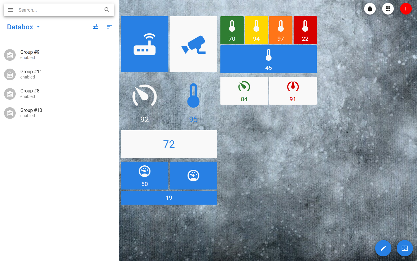
The following settings are available for the data box:
- Icon Selection.
- Selecting the display mode — icon and value, icon only, value only.
- Size selection — small and large widgets are available.
- Style Selection — Four color schemes are available.
- Setting up the location — the widget can occupy the full row of the container group or share it with other widgets.
- Optional colors — the widget can change the color depending on what value it takes.
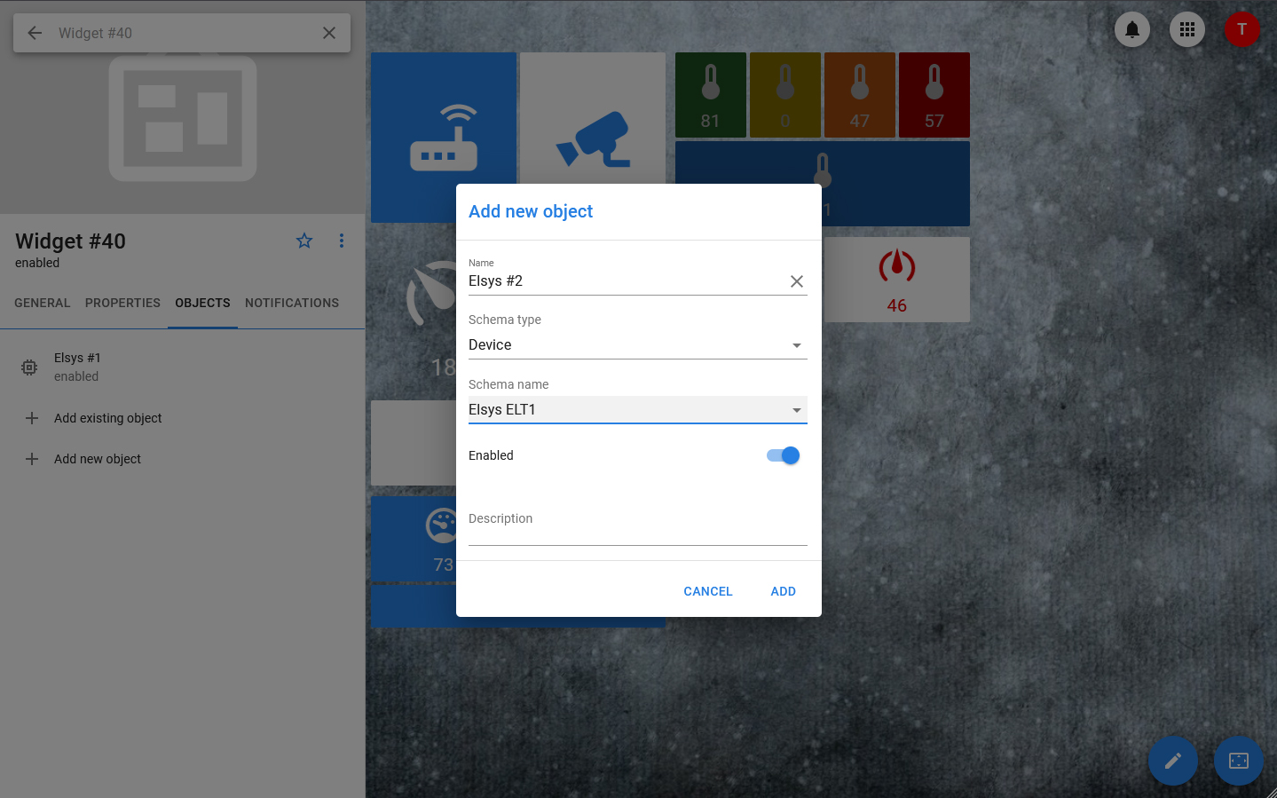
Both existing and new objects can be linked to databox, for example, devices or special analytical datasets that allow for various calculations.
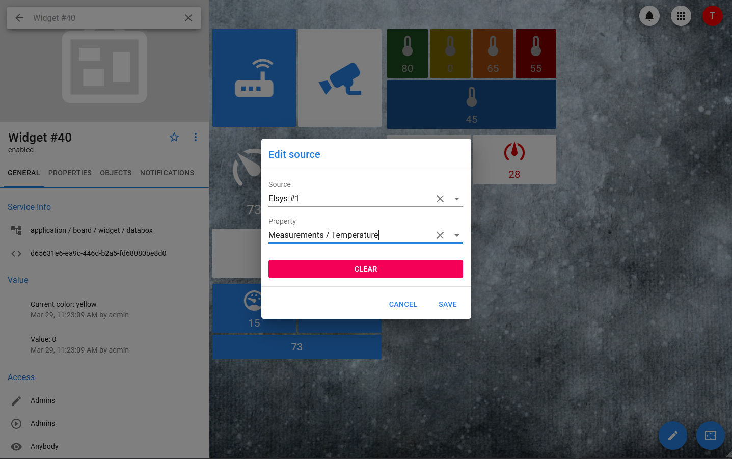
The property of the linked object can be selected as the source for the databox value. When you change the property of an object, the value of the date box will immediately take the same value, regardless of which display mode is selected: even if the value is hidden and only the icon is displayed, it will always be relevant and can be viewed in the widget card.
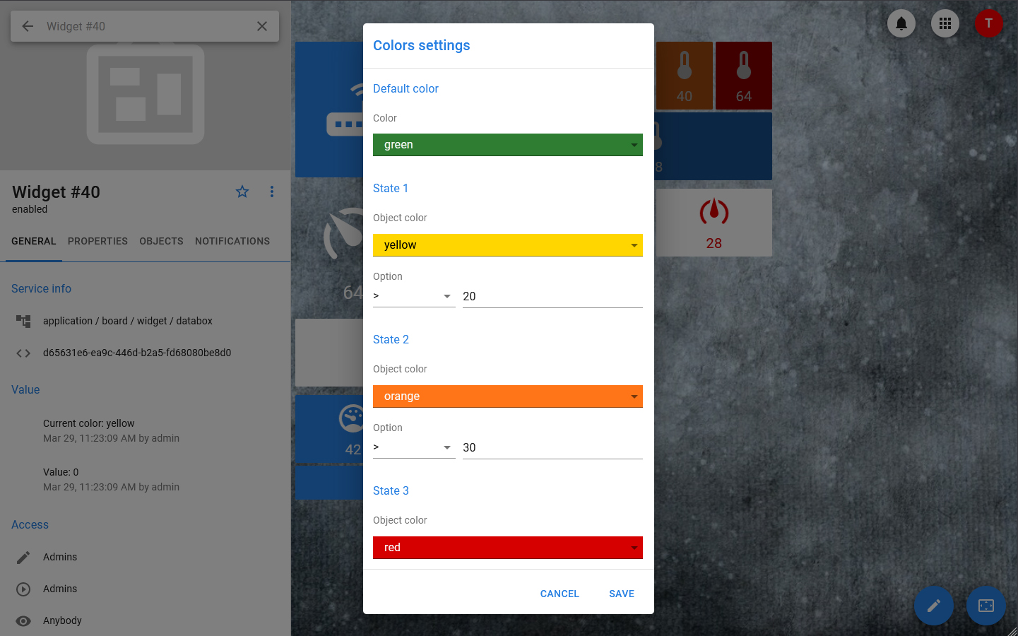
Additional colors can be set for the widget: in addition to the theme color, it can be green, yellow or red. In the settings, four positions are set (the main color, the first optional color, the second optional color, the third optional color), as well as the conditions for using optional colors. The calculation of the current color is based on the principle:
- If the conditions for optional colors are not met or are not set, the primary color is applied.
- If the condition for applying the first optional color and only it is met, then the first optional color is applied.
- If the condition for the second optional color is met, then, regardless of the condition for the first color, the second color is applied. For the third one, it is the same.
For example, if the main color is green, the first optional color is yellow with a condition > 5, and the second optional color is red with a condition > 10, then if the property takes the value 1, the widget will be green, if 7 - yellow, if 11-red.
In addition, the data boxes have the ability to set from one to three critical events, at which the data box will go into an alarm state. Each event is described by a simple comparison with a constant value, the amount of delay (for situations where the transition to the alarm state should not be caused by the fulfillment of the condition itself, its fulfillment within a certain period of time) and the choice of the time and days of the week when the condition should be checked.
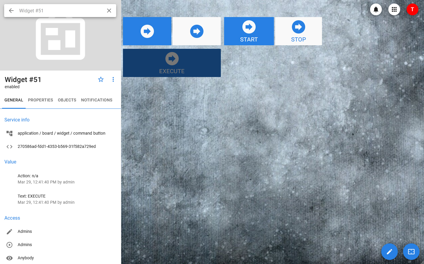
Command button
Command button is an interactive box widget designed for sending commands with a logical or set (constant) integer value.
The button is linked to the object control, which is sent when the widget is clicked. It can be used to send controls with parameters, but in this case the parameter values are fixed and they can be changed only through the widget settings, and not through the dashboard itself.
The following settings are available for the widget:
- Size selection: large or small
- Color scheme selection: 4 standard color schemes are available
- Selecting the display mode: only the button or the button and the value
- Optional setting of the full-line mode
This widget does not support changing the color.