PixelBoard interface
The PixelBoard interface is designed for viewing and editing dashboards. It can work in two modes:
- Normal mode — in this mode, in addition to the dashboard panel, a side panel is displayed on the screen, which includes a search bar and a list of objects or a card of a specific object, as well as buttons for calling the notification list and the menu of the current user, located in the upper-right corner of the screen.
- Full-screen mode — in this mode, only the dashboard and the button to switch to normal mode are displayed.
Navigation
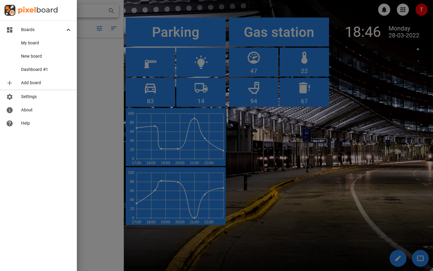
The app is navigated through the menu, which is hidden by default. The menu displays a list of available dashboards, as well as sections intended for managing the application.
The menu contains sections such as:
- Boards — selecting this section expands the list of available dashboards in the menu.
- Settings — this item opens the application settings window.
- About — this item opens a window with information about the application.
- Help — link to the online version of the documentation.
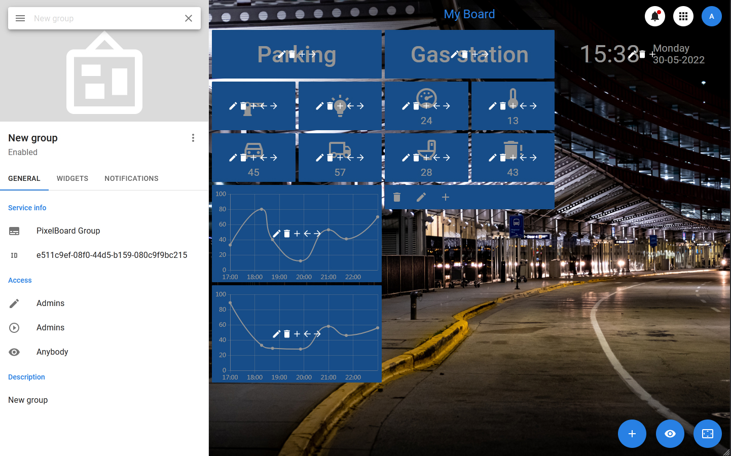
Cards
Regardless of the selected category, detailed information about the list item will be displayed in the card on the left side of the screen. The card consists of a header that includes an entity image, an avatar, a name, a status or a set of statuses and a toolbar, as well as a set of tabs.
The composition of the tabs depends on the type of entity, but in most of the cards there are such tabs as:
- GENERAL — a tab with basic information, which displays the values of the main fields, a description, a unique identifier. Tags and groups can be displayed (if there are any). In this tab, the widgets display the current value, for which an alarm can be set.
- PROPERTIES — a tab that displays all the properties that an entity has.
- OBJECTS (or WIDGETS) — a tab that displays a list of objects associated with the selected one. By selecting an item from the list, you can open the card of the nested object.
- NOTIFICATIONS — notifications associated with the object.
The toolbar of the card includes a button to open the context menu and a button to close the card, and can include a button to manage favorites (filled with an asterisk — remove from favorites, not filled — add). Closing the card returns you to the list.